New look & feel
< overview

Rebranding triggered more in vogue communication style
Client: B-Park
Period: launch june 2021
Target group: B2C
Services: brand identity & design, online & social marketing
The challenge
B-Park is located in Bruges, near the Blauwe Toren, right between the wind mills. The retail park tops the ranks in terms of reachability and the choice of shops, of which many are open on Sunday. Their logo is colourful and easily recognisable, however, it was high time for a restyling of the look & feel and turn the communication style into a more contemporary experience.
Our solution
For some years now, we are taking care of the community management of this retail park. Since we visit regularly and stay in close contact with the retailers, we quite quickly knew the direction we wanted to go. The only condition was that we kept the logo.


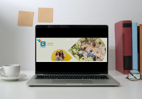
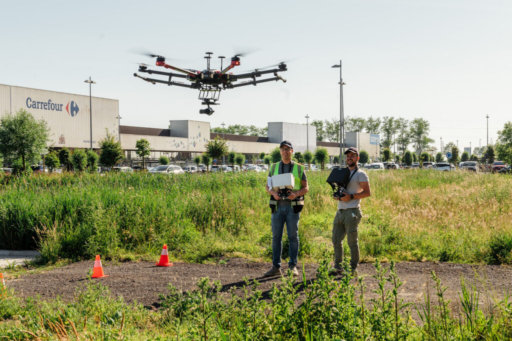
We opted to tone down the four colours of the logo and chose four new ones, which gave the corporate branding a warmer and more modern vibe. To increase recognisability, we lifted one element from the original four-leaf clover logo and use it as a recurring visual element. We also organised a photo and video shoot using drones, to get the right photos to help create the atmosphere we wanted. The end result came up perfect and every B-Park communication channel was given this new look & feel.


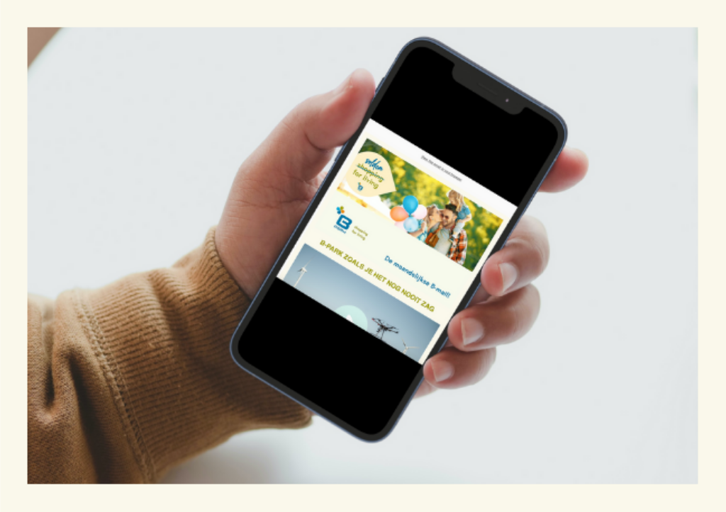
At the same time, we went through the content of all communication, ending up with a brand new website, a testimonial video, a monthly newsletter that we overhauled into the B-mail and even the beginning of the B-Park Instagram account.
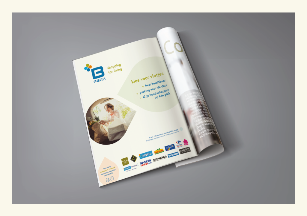
The launch of this new look & feel of course could not go unnoticed. Regular clients were informed via the B-Park channels, whereas a wide audience was reached with a regional advertising campaign in print, on social media, radio and VTM GO.
wisely bv
Kasteelstraat 6,
8500 Kortrijk – Belgium
BE 0690 665 041
CONTACT US
hello@wearewisely.com
+32 (0)477 80 33 79
